remote Maternal health Monitoring
Maternal mortality in the United States is on the rise, particularly among native, women of color, and those who live in rural areas. With an increasing number of hospitals shuttering their obstetric units and limitations posed by lack of transportation and poverty, can technology serve to overcome these barriers?
OVERVIEW
I designed a conversational and visual interface system to connect underserved women to healthcare services during the perinatal period. The design was submitted in a federal competition where it won awards for remote pregnancy monitoring. The app was later sold to an innovative maternal health company in July of 2020.
WHAT I DID
Research, design research, user interface design, conversational interface design, prototyping, pitching, building a team, and coordinating tasks
My role
Founder and lead designer
Duration
Two years
Please note that this project has been sold and per the purchase agreement, all design assets are now the property of the buyer. Therefore, this case study will focus exclusively on the process of designing and eventually selling a remote maternal monitoring app.
Why did I decide to create a maternal monitoring solution?
It was a personal loss that drove me to create a maternal monitoring app for a class assignment. This project grew from there.
HOW IT ALL BEGAn
“It’s not supposed to be this way.”
In 2008 my friend died on her 32nd birthday. She was beautiful, ambitious, warm, and a brand new mother. Her loss was devastating.
Nine years later, my friend sent me this NPR report. I thought of my friend. I also thought about another friend of mine who lost his wife under very similar circumstances. Prior to hearing the report, I had just assumed that what happened to these women were random outliers but with this new information, I began to wonder if they were part of a growing trend facing our nation.
Step 1: Defining the Problem
As you can imagine, US maternal mortality and morbidity is a complicated problem. There are many factors (e.g. poverty, systemic racism, accessibility, assumptions, lack of training, etc.) that all play into these sobering statistics. So in order to make designing for this even remotely possible, I really needed to understand the problem and the first part of that process was figuring out WHO was being affected and WHY.
Maternal mortality rates are rising for rural women. One reason is obstetric deserts.

Why are women dying?
Many American women face multiple barriers to healthcare. Poor outcomes are often not their fault and incredibly difficult to overcome.
The first thing I did was to turn to the internet to get a general idea of who is affected. In my research I found that the women most affected were rural, African American, and Native women. Now I had always assumed that the reason more women were dying was because they couldn’t afford healthcare but that really wasn’t the whole story or even the case for many women. What I did find out was that many hospitals in rural areas were closing down their obstetric units because they were just too costly to run. And many women were forced to travel 1-2 hours to each prenatal visit and travel that same distance or farther when it was time to give birth. Many of these women, fearing that they were going to deliver their babies on the side of the road, were opting to have elective Caesarean sections or inductions. This in-turn was leading to more complications and many women were too far from the hospital or too busy/overwhelmed to go. Pre-exisiting health problems, obesity, and advanced maternal age also contribute to these complications.
For poor women in urban areas, it was kind of the same story. Like the rural women, it was also very hard for poor urban women to get to their appointments- lack of transportation and childcare being the most noted factors. There is also a level of racism in healthcare that plays into women of color receiving less than optimal care, even when they are face-to-face with it.
In sum, a variety of barriers to care is what is preventing women from getting the medical attention they needed.
At this point it looks like I have a direction in the sense that I know we have three underserved groups of women and what is getting in the way. Now it’s time to talk to some of them.
Step 2: The Interviews
The first thing I did was call up my friend who is a nurse at the Cleveland Clinic. I asked her to give me some insights to what she felt were the major sticking points for at-risk women. She pointed out that a lot of women don’t understand their symptoms and can’t figure out what is normal. They default to sitting and waiting at home, to sometimes dire consequences. She then pointed me to a common nursing checklist and it was from that checklist I got the inspiration for my first iteration of this project.
But before I put pencil to paper, I went online and basically put out a plea/beg for women who fit the aforementioned groups to give me a call. I didn’t really know any Native Americans but it wasn’t too hard to find people from the other two groups. Here are a few examples:
Why talk to people?
Talking to people is a great way to get to the root cause of problems quickly and inexpensively. I got great insights from these interviews.
The Takeaway:
What I heard from the women I spoke to reiterated what the research was saying all along and I picked up themes of isolation, insecurity, and fear. Women were having to travel far for OB appointments and one opted for an induction in order to get some sense of control (again, what the research already pointed to).
What surprised me was that I picked up on a theme of apathy and I began to wonder how apathy could play into patient outcomes. One interviewee said, “What’s the point in saying anything? They [the providers] don’t listen anyway.” In further research I found that many women of color feel apathetic about their healthcare experiences and don’t reach out when they have trouble. Some researchers have theorized that this is due largely to American healthcare’s historical record of treatment with people of color (bad, very bad treatment).
At this point we have the who, the why, and we have a sense of what is being experienced.
Step 3: Ideation
Why explore systems?
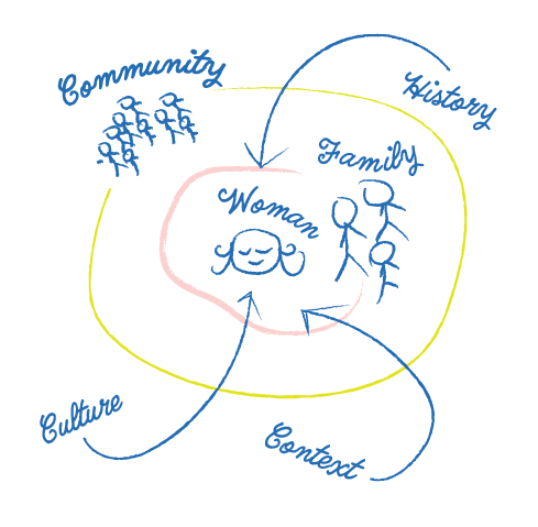
Everyone is part of a network of interconnected and embedded systems. No one is an island. To ignore these factors would be tantamount to building a house without surveying the land.
I had the problem and some research. This is the time when I started to brainstorm. I created mind maps, journey maps, empathy maps- just about any map you could imagine. I sketched out how women fit in with their communities and explored the barriers that they were facing. Whatever the solution was had to overcome these barriers. And since there is such a plethora of obstacles, I needed something low cost and simple. Maybe a smartphone app was the way to go?
Step 4: Prototyping the First Iteration
For my first iteration, I simply created an app prototype of the nursing checklist my friend recommended. I started by creating a user flow that uses a series of Boolean functions to help the user figure out if she needs to go straight to the ER or call her doctor’s office. I made both mobile and desktop versions of the app with XD and Invision respectively. Visually, it looked a bit like 90s medical text book - drop shadows everywhere but it would suffice for testing.
Step 5: Testing
The prototype was cranked out in a couple days and it was time to take it for a spin. Now when I say “test” I didn’t use a beautifully scripted test in the field- I just put it in front of people and said, “try it out”. Not your most robust testing and now, looking back, I am a little embarrassed that was how I did it. 🙈 It seemed to work fine but I really wanted to see what nurses thought. I wrote to a variety of nurses, including the nurses who developed the nursing checklist for feedback and NONE responded. I was disappointed but I decided to continue to truck on through. I will get feedback eventually!
Step 6: Addressing BARRIERS
At this point, I felt that the first iteration of the app was just too simplistic and didn’t really address the bigger issues, those barriers that keep women from care and patient apathy. The prototype was really just designed to help people make some sense of confusing symptoms and. . . that’s it. It does not touch on the real “meaty” issues like apathy and lack of access. So it was back to the drawing board (see literal drawing board).

Why organize thoughts in this manner?
I sketched out what women would look for in regard to their obstetric care and organized these potential utterances into categories. It was these categories that would guide the next iteration of the app. I found that there were many questions regarding physical health, mental health, community services and resources.
Step 7: Building a Conversational Interface
This is a rather beefy section that has been moved to a separate case study. Don’t worry though, it doesn’t ruin this story to move this part out, just know that I was working on both a visual and conversational interfaces at the same time.
Step 8: The Contest
I am not really sure what compelled me to search for UX competitions but I stumbled across the Remote Pregnancy Monitoring Challenge offered through the Health Resources and Services Administration. The HRSA is an offshoot of the Department of Health and Human Services that is the “primary federal agency for improving health care to people who are geographically isolated, economically or medically vulnerable”. This was exactly the kind of people I had been designing for in class. The only constraints presented at this point was that solution had to be scalable and work throughout pregnancy. For this portion of the competition, I proposed a multimodal solution that worked with a variety of devices as I was trying to find a solution that worked with extremely rural women outside of cellular service. As I got knee deep into learning about ultra-wideband radio, FCC regulations, and HIPAA compliance, I realized that this was getting far too complicated and decided to scale back to just the smartphone app and chatbot for that very reason.
Step 9: OMG . . . I WON!
Three months after I made my submission, I found out that I won. I was awarded $10,000 from the government (thank you, Uncle Sam) and I was told to prototype and test my innovation and pitch the idea to the feds in September in 2019. I am not going to lie, after the joy of winning passed, I felt overwhelmed at the prospect of presenting. The other winners were full fledged start-ups with millions in funding or universities with armies of graduate students. Imposter syndrome is real, yo.
STEP 10: LET’S DO THIS!
Now into the second phase of the competition, HRSA said that they wanted a solution that did the following:
Increase remote and virtual access to quality care for low-income pregnant women
Alleviate barriers to quality care
Improve communications among patients, providers and/or broader support networks
Empower pregnant women with knowledge and tools to monitor their health and care
Benefit women who live in rural and medically underserved areas who have limited access to on-site prenatal care
The goal of this challenge is to use technology to allow women to experience the benefits of an ongoing relationship with a health-care provider to keep them and their children healthy.

Why an app?
The solution needed to be scalable, affordable, easy, and convenient. A smartphone application made all of this possible.
I set out to hone my solution so that hit these five bullet points while keeping in mind the feedback and type of information people expect from their healthcare provider. For example, the language barrier could be overcome by offering the app in different languages, the limited time barrier could be compensated by forming partnerships with urgent care centers or “MinuteClinics” so that women could come in after hours, and so forth.
At this point the smartphone app made the most sense to move forward with. 96% of our target demographic have access to a smartphone, our users were familiar with the patterns and the way smartphones work, it could be rolled out more quickly than a novel device that would need FDA approval, and it was easiest to prototype and test.
The testers loved it and feedback from medical professionals was just as positive. Providers loved the idea of a way for women to get reliable information specific to their stage in pregnancy and felt that the app showed real promise. One physician noted, “this would save a lot of 2am calls!”
During this phase the app was tested with a total of 88 individuals. I made sure to spend extra time exploring the app with women of color to ensure that they felt represented in the illustrations and that the app was inclusive. I also made sure to test the app with people of varying education levels to ensure that everything made sense.
Visual Design
(AKA "What the heck did you make?!")
I am not going to lie, trying to explain how I created the visual design without being able to show you anything that I made is a bit tricky. So, for the sake of legality, we're going to focus on the process. You're just going to have to trust me that the app was pretty enough for a beauty contest.
- Develop a tone for the app. My target demographic was young women who are feeling an array of emotions including fear. I need something soothing but not too cutesy. Funny, but not flippant. It had to convey seriousness.
- Select a color scheme. Together with a fellow UX designer, we went through color schemes on Adobe Color to find a harmonious five color scheme.
- Choose an illustration kit for the "sprites". My buddy and I went onto www.creativemarket.com and selected a premade illustration pack that had a variety of heads, arms, skin tones, and clothing to quickly put together images for the app.
- Purchase the correct license. I purchased commercial licenses for the packs.
- Color contrast testing. I ensured that the color selected for text and backgrounds were AAA rated for accessibility.
- Establish information hierarchy. I needed to figure out the basic layouts of the screens. They were mostly a largish image on top, one to three lines of text, and yes/no buttons.
- Figure out the sizes for components. This was done mainly through WCAG guidelines.
- Select a font. I chose a simple sans serif that was easy to read.
- Illustrate for days. So. Many. Medical. Conditions. Thank goodness for the kit! That saved me so much time!
- Put everything together. Time for testing with our new, beautiful app!
Step 11: Phase Two Presentation
In September of 2019 I traveled to Washington, DC to HRSA and delivered an eight minute pitch about the app. We laughed, we cried, and to my utter shock and surprise, I won $31,000.

I am the one in pink.
STEP 12: Phase Three and COVID19
After I received the initial instructions for Phase Three, I began to work on expanding my user testing. I continued to do more user testing on a larger scale and yielded statistically significant improvement in all tested areas. I moved forward with training and teaching my chatbot. And, most importantly, I worked with a developer who coded the Android app from my designs.
Oh, in case you missed it. . .
An Android app was created from my designs.
Squee! Everything is aligning perfectly!
Then COVID19 hit. Arizona State had canceled all external data collection and studies. I reached out to a number of tech companies and health entrepreneurs for advice but no one returned my emails. I even set up a meeting with a tech CEO to discuss how to tell if a product should be let go and was stood up. . . twice! Yikes!
And then I got an email late one night.
STEP 13: SELLING THE APP
A CEO from a company in another state expressed interest in my product and after review of its assets, they decided to purchase the design and everything I had done over the past two years. Everything was finalized over the summer of 2020.
I was and am filled with a whirlwind of emotions. I am humbled that something will be coming from the work and love I have put into this project and that it’s in the capable hands of those with the resources to make it a reality. There’s also that feeling that I can only imagine is what parents feel when their children go off to college- pride with a bit of sadness mixed in. I am sure going to miss working on this app.
Everyone’s pregnancy and birth experience is unique and some of those experiences can be quite difficult. It is my sincere hope that the app sets to help women in a time that can be just as confusing as it is exciting.
THANK YOU
I would like to thank the many people who have helped me on this journey: professors, colleagues, friends, and kind strangers who guided me with their wisdom and experience. To my husband, children, and family, thank you for your unwavering support.
IN memoriam

This project is dedicated in loving memory of Sonia Belcher. May her memory be eternal.