USER RESEARCH: Testing the REMOTE MATERNAL monitoring app
A fairly large amount of the work for the remote maternal monitoring project actually involves user research. No decision was made without support and insight from those studies. I was able to recruit one friend, Amanda, to help me with this endeavor and together with just a little bit of cash, we implemented our user tests for this application.
OVERVIEW
With the help from a friend, I helped test the remote maternal monitoring project on a limited budget.
WHAT I DID
Script writing, website development, recruitment, data analysis, user test development
MY ROLE
User Researcher
DURATION
Two years
Please note that this project was sold and all assets are now property of the buyer. Therefore, this case study will focus solely on the process of conducting user research.
Step 1: Designing Usability Studies
After I completed the first phase of the HRSA competition, I knew it was time to do serious testing with the app. There were a few key areas I was looking at:
Ease of use (Are you users able to navigate through the app without workarounds?)
Improvement of outcomes (Will pre and posttesting show that users are improving their understanding/assessment of their symptoms and seek the appropriate level of care?)
Representation (Do the images and language of the app sensitive to diverse groups? Do all women feel represented?)
Language understanding (Is the language easy to understand?)
Overall satisfaction with the app (Are our testers happy with the app? Is it something they will use?)

Why an ugly paper prototype?
We have to test the IDEA of the app before diving into the “fancy version”. We need to make sure that the idea of the app makes sense. We could have gone with a simple XD or Invision prototype but for the sake of simplicity and screen size issues, this just made things easier.
Now user testing for a project like this is a pretty big task. My friend from class, Amanda, had expressed interest in a career with user research and offered to help. Awesome! The first user tests were done by Amanda and are not included in this case study because at this point I was frantically illustrating and designing the app and I simply did not have the time to do user testing. So I made a very rudimentary paper prototype of the app that was essentially text on white paper and handed that to Amanda and said “go!” Amanda wrote out a script that consisted of commands "(e.g. show me where you would enter your temperature) and did the initial testing for me.
Amanda found out that aside from people thinking the paper prototype was hideous (I will not disagree with that), they had difficulty with some of the language and had trouble conceptualizing certain aspects of the app. I have listed these below:
Initial Findings
Emesis is not the best term. Just say vomit.
The kick counter was confusing despite the description added.
People didn’t care for the YES/NO placement.
People were confused by the vomit counter.
STEP 2: REITERATE AND TEST
It was at this point that I had to redesign the app with the feedback I received from Amanda’s user test. From the feedback received from the initial user testing, we changed the wording, certain features and descriptions, and placement of buttons.
It took me about a month to get the second iteration of the app ready for the next rounds of user testing. I created nearly 300 artboards! Since I was mostly done building the app at this point I decided to take on more testing. I started by writing up my own user research scripts.
Script Writing
Again, I was looking at these key features: ease of use, improvement of outcomes, representation, language understanding, and overall satisfaction with the app. I felt that these were still good areas to analyze and I wanted to continue to use these as my baseline. With that in mind I created scripts to test during the next few months for both me and Amanda.
nerd corner
I want to take a moment to explain how everything was assessed a little more in depth here. Now while I cannot share the actual scripts, we can dig a little deeper into the process and findings.
Ease of Use This was not explicitly stated in the user script but was assessed by the number of correct outcomes (users were not able to use work arounds). I always aimed for at least 90%. If I didn't hit this, I knew the design had to fix the language or imagery in order to reach it. The only area that needed some work here was chest pain. Women had a tendency to naturally downplay chest pain! No good!
Improvement of Outcomes This was done through pre and post test. Users were given a scenario and asked, without the app, what they would do with a certain medical situation. Then they would be handed the app and told to use app to help them in that same scenario find the appropriate level of care. These were assessed as PASS/FAIL per item. PASS was given a score of 1 while FAIL was given a score of 0. Then, with the use of an online calculator, statistical significance was calculated. I hit this fairly quickly and didn't require much work.
Representation This was simply done by asking women of color if they felt represented in the imagery of the app and if the app's language was appropriate. Regardless of the answer, I always followed up with "are there ways I can improve upon this?". I hit this almost immediately at 100%.
Language Obviously, if people can follow instructions they probably understood the language to some level. But asking people what words mean or if anything is difficult to understand can yield some interesting insights too. So we included in some scripts a statement that went along the lines of "Do you understand the language presented?" or "Are any words you find difficult?" I also entered in phrases in a grade level assessor and got about a fifth grade reading level on average (ACOG recommends at least a sixth grade reading level for all patient literature). Very little changes were needed as nearly all women, including non-native English speakers could understand the simple phrasing of the app.
Satisfaction This was an easy binary response to score. Do you think this app could be beneficial to pregnant and postpartum women? By the end we were scoring around 95%! Awesome!
data dump
It was a research blitz at this point. Amanda and I would run off, conduct our research, run back, report, tweak the app, and repeat the process over and over again. But in addition to project insights, I did learn a thing or two about the research process:
If you have a target demographic in mind, immediately consider how you are going to get participants. I naively thought that I would just find rural and native women and by the time I realized I was missing these respondents, it was late in the game. I did reach out to many rural colleges and agencies but they were reluctant to have me test with their populations. I should have planned better.
Be careful with what you compensate-you don’t have to be too generous. I really needed black women’s opinions on the app so, in desperation, I started offering $50 for each person’s input- which is fine when you are a huge company but as a regular person with just some prize money, that added up really quickly. Time to think smarter with this one.
Moderated studies take a lot of time and scheduling. Maybe unmoderated is the way to go?
STEP 3: THE UNMODERATED STUDIES

Why did you code your own webpage to conduct your test?
I could not find a ready made program that could do this affordably. By coding my own webpage, I was able to get the data I needed efficiently and easily and in exactly the way I wanted it!
At this point, I was on my own and I needed to come up with a way to efficiently gather data with larger numbers of participants (including those targeted demographics). The way that I felt would be easiest would be through an unmoderated usability study. So I started by learning about unmoderated usability studies and searched high and low for a program that could help me achieve this with my XD prototype.
I couldn’t achieve this. Essentially, my need to have both the survey and prototype available simultaneously could not be achieved affordably. So I made it myself.
So I came up with an idea. . .
And went off to code it.
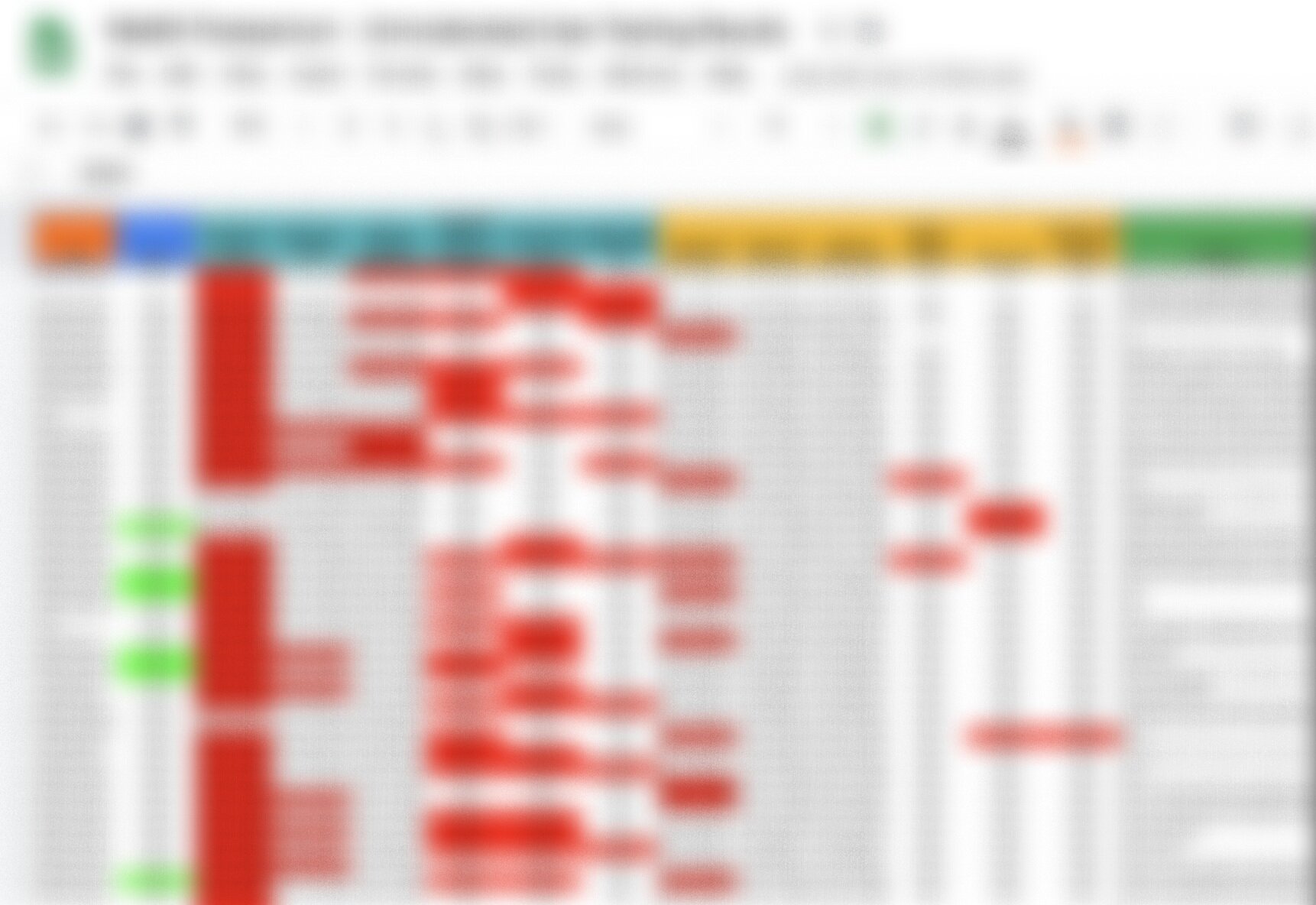
Typeform allowed me to have the data go directly into a Google sheet document. When my test concluded I went though and used the pivot table feature to process and analyze the data. I then went through and tested for statistical significance. I cannot show the data but you can see that even from the color coded responses in the blurred photo to the lower right (further down on mobile), user assessment of symptom severity improved tremendously with the app (Red blocks are errors in self assessment of symptoms. The content beneath the blue is the pretest and the content below the yellow is with the app). In fact, each area tested showed statistically significant improvement in all areas with the app. I was thrilled.
Step 4: More unmoderated testing
Boy, that was EASY! I decided that for this project and the limited funds I had to work with, unmoderated user testing was the way to go. I was able to use data from 86 participants. By offering a few larger prizes rather than paying each and every person, it was not only easier, I saved a ton of money and time. Let’s do it again!
For my next test, I needed to work on my chatbot and, in particular, I needed to get more data on the natural language of my users. This test was easier because I just needed "utterances” so I could feed my chatbot the terms and phrases real people would use.
So I made another test in Typeform. The tricky part about this test is that I didn’t want to put words into people mind. I wanted things to develop. . “organically”. Is that the right term? I asked some basic demographic questions and displayed a series of images from the app and asked people to type in their symptom based on the image. I got some funny ones but for the most part, people understood what they were seeing and were able to effectively communicate their condition. With the exception of the image of seizure. . .that is such a hard one to depict.
In all I got responses from 103 people! And this time I offered two $100 prizes. So I got data from 103 people and it only cost me $270 ($70 for the Typeform subscription and two $100 cash offers chosen at random).
the takeaway
For the remote maternal monitoring project, I had to find creative ways to do user research efficiently and affordably, which included unmoderated usability studies, drawings, and using pre-existing software and coding when needed. I do acknowledge that unmoderated testing does have a certain level of risk as you’re putting your project out there. That being said, I did put in place safeguards by disabling most features of the app when it was open for testing, testing within a 48 hour period, and only testing very small parts at a time. I was careful to mention that the app is for “research purposes only” to avoid any legal issues and checked with my attorney to make sure I wasn’t ever putting myself at risk of liability.
As indicated earlier, this app has been sold and so I am not working on it anymore. That being said, I want to reiterate the importance of user research in design and development. User research is a crucial part of answering the “why” to design choices and makes for a stronger case when answering questions from higher ups, judges, or whoever might looking over your work. To be able to backup your choices with data is paramount to good design.